The RTH charts are based upon tick volume, rather than time. Therefore, there are some differences you will notice.
First of all, RTH stands for Regular Trading Hours, which generally will be approximately 8:20am-5:00pm US Eastern Time. This encompasses the bond day session and the stock day session in Chicago and New York.
Each chart specifies a certain number of ticks which make up each price bar. This is fixed for each chart. The volume bars at the bottom of each price chart represent the number of contracts which traded during that number of transactions.
The right side of the price plot shows the volume of contracts which have traded at the corresponding price cumulatively. Low volume areas are shown in red and high volume areas in blue. Red areas tend to be support or resistance price areas (trend reversal prices), while blue areas tend to see trends continue. This is not a hard-and-fast rule, of course, but an observation.
Because the horizontal axis of each chart is determined by the number of transactions in each bar, we cannot project it into the future like we would on a time-based chart. However, the trendlines shown on the chart are projected into the future.
The indicator portion of the chart will sometimes show a Money Flow Line which is similar
to the money flow lines we show on other charts. Each background bar for this area is shaded red
if the last price is greater than a previous price at that bar, but money flow is lower than
it was at that bar. If the opposite situation occurs (price is lower but money flow higher),
that background bar is shaded green. Green indicates a bullish divergence and red a bearish
divergence. If there is no divergence, the background is left to default to midnight blue.
Note that we are always comparing the latest price and level of the money flow line to each
prior bar shown on the chart.
Spread Charts
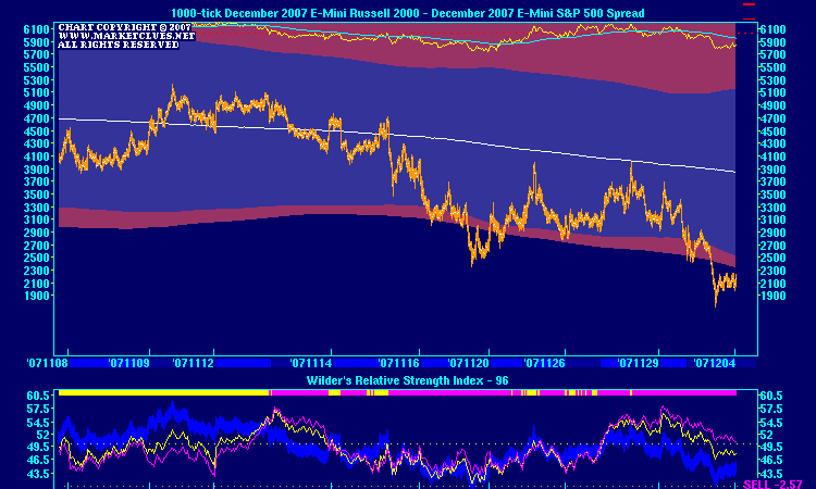
We sometimes show a triple RSI Oscillator in the indicator plot of the chart. The RSI Oscillator values are computed based upon the individual dollar-weighted legs of the spread and the spread itself. The yellow-colored oscillator line corresponds to the left side of the spread and the magenta-colored oscillator line to the right side of the spread. The deep blue oscillator line corresponds to the actual spread itself. Here is an example of such a chart:

When the yellow line is above the magenta line, the horizontal bar will show yellow; otherwise, it will be magenta. This bar makes it easier to see when one line is over the other. You may notice that when the blue oscillator is in oversold territory (below 50), a move of the yellow over the magenta often presages rallies in the spread. Similarly, when the blue oscillator is in overbought territory and the magenta is over the yellow, a decline is a likely outcome. Remember, in general, when the yellow line is over the magenta, it means the left side of the spread is outperforming. When the magenta line is over the yellow, it means the right side of the spread is outperforming. The amount of separation between the yellow and the magenta is a good indicator of the strength of the trend in the spread. In the example chart above, the yellow line is substantially below the magenta, indicating a strong downtrend in the spread itself is underway. Note how the spread is below the lower trading band, indicating a deeply-oversold condition as well (which confirms the low level of the blue RSI line).
Another indicator which is shown on the spreads charts is a Bollinger Band Deviation indicator, which shows how much difference exists between the current market and the middle moving average of the Bollinger Band. If the difference is less than one standard deviation, the indicator is zero. If the difference exceeds one standard deviation either above or below the moving average, the indicator shows the extent of that difference.
This indicator can be used to indicate visually whether the market is "too stretched" to one side of the middle band or the other. Usually, you will see some divergence in the direction of this indicator well before a turn.