Parabolic Stop-And-Reverse (PSAR)
J. Welles Wilder Jr. created this indicator. It is a good indication of
trend when the red dots are paralleling price action. However, during non-trending
phases, it will generate losses. See Wikipedia
for additional information.
Line Break Indicator
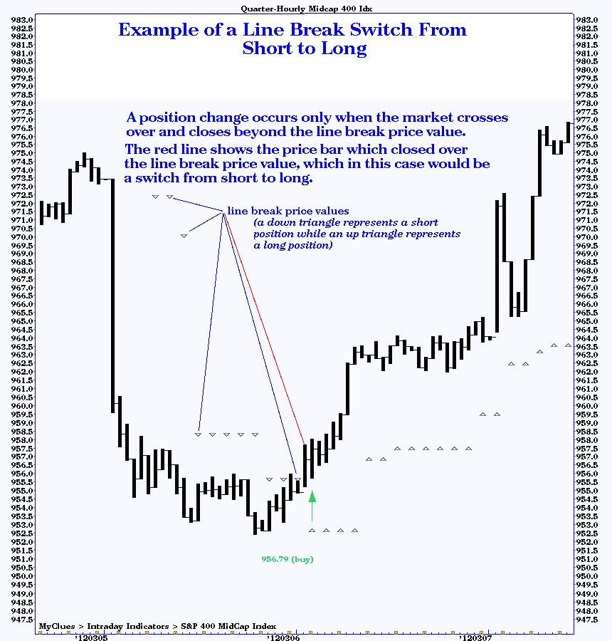
The current value of the line break indicator is shown in the upper right-hand corner of each chart:
Polylines (Polynomial Non-linear Trendlines)
The text shown within the leftmost column in the table indicates by matching color which trendline it is associated with. This text may be any of the following three types:
- the set of points in time and price used to construct the trendline
(if two points are used, a straight trendline results; if three points are
used, the trendline is a second-order polyline; and so forth);
- a straight line, if the points used in constructing the trendline
are not available;
- or, a text description of the significance of this trendline.
Up to 10 polylines may appear on any individual chart. Since moving averages are always a shade of blue, no polyline will appear bluish.
We have found that many markets will exhibit trending behavior not wholly explained by a simple straight (linear) trendline, but will tend to follow a curved (non-linear) trendline. These trendlines are constructed using three or more significant highs and/or lows. Longer-lasting trends tend to follow conventional straight lines. However, some significant market moves do take place along polylines.
Often, price moves to the trendlines will allow optimal trade entry
and exit.
Bar Colors
The daily charts display three colors of price bars: often red, green and purple, although
the red color may be replaced by another to improve the contrast of the price bars against a reddish background.
The color painted on each bar are:
- red if the trend is neutral (not trending up or down);
- green if the trend is up;
- purple if the trend is down.
The method used to determine trend is based upon the article Timing is Everything (or at least one more thing to watch) by Alex Saitta in the September 1997 issue of Futures magazine (page 50). Non-trending areas are marked by red price bars, while bullish trends are identified by green price bars and bearish trends are painted in purple price bars. The bottom line: at least for the bond market, according to the author, breakout signals tend to be more profitable if the bond market has been in a non-trending mode for 22 or more trading days preceding the signal.
This is also likely to be the case for other markets as well (the length of the non-trending timeframe is likely to differ, however), so we've implemented the technique described in the article for all of the daily charts. Here's a very brief capsule description of what we did: we first construct a Moving Average Channel (MAC, not shown on the chart, which consists of two moving averages: a 10-day average of high prices and a 10-day average of low prices). When the market first closes above the MAC, a buy signal is generated. When the market first closes below the MAC, a sell signal is generated. If the profit from that theoretical trade is more than 0.5%, all of the price bars within that trade's timespan up to and including the preceding high or low (depending upon whether that trade's position was long or short, respectively) are considered trending and are painted green or purple; otherwise, that period is considered non-trending and is painted red.
Obviously,
we skipped a lot of detail in this capsule summary. For a detailed
description of the MAC and this technique, please refer to
the September issue of Futures magazine. The author is a vice-president
and technical analyst focusing on T-bonds at Salomon Brothers in New York.
Top Plot: Magic-T Theory
Magic-T Theory was created by Terry Laundry. It works from the premise that markets spend an equal amount of time under accumulation and distribution. The centerpost of the T represents the time of transition from accumulation to distribution, generally corresponding to a buying opportunity as prices start rising from the low.
The right side of the T represents the end of rallies.
For more information about Magic T-Theory, read Terry Laundry's Blog.
Bottom Plot: Tick Money Flow Indicator
The bottom plot shows a money flow line based upon a modified on-balance volume
calculation. When a trade tick is up, the volume is multiplied by the trade price and
added to the line. When a trade tick is down, the volume is multiplied by the trade price
and subtracted from the line.
Divergence between the last charted price (the current price) and all historical prices shown on the chart is shown by the shading on the particular historic timeframe being compared. When the current price is lower than a particular historical timeframe, but the money flow line is higher, the background for that historic timeframe will be shown as dark green, representing a condition of Bullish Divergence. When the current price is higher than a particular historic timeframe, but the money flow line is lower, the background for that historic timeframe will be shown as crimson, representing a condition of Bearish Divergence. Otherwise, when price and money flow are in the same direction, neither dark green nor crimson will be shown.
This has great value as a filter for trade signals generated by other systems. For example,
let's say you have a BUY signal from another system or indicator, but the tick money flow
shows considerable selling into the rally (in other words, a lot of red is showing) -- this
indicates that the big money may be selling into the rally and it is not an opportune time
to buy. Similarly, if a lot of green is showing, it is probably not a good idea to sell short.
Bottom Plot: (Bottoms-Up) Accumulation-Distribution Indicator
The bottom half of each chart plots an indicator which measures the accumulation (buying pressure)
and distribution (selling pressure) in each stock within the index or sector and sums these. Note
that this is a different indicator than the one below, the Accumulation-Distribution Oscillator.
Look for bullish or bearish divergences to indicate a significant change in trend for the
index or sector. This indicator is either positive, meaning net accumulation, or negative,
meaning net distribution. Positive readings on the indicator confirm an uptrend and negative
readings a downtrend.
Bottom Plot: Accumulation-Distribution Oscillator
The bottom half of each chart plots an indicator in yellow, usually the
Accumulation-Distribution Oscillator (or AD
for short). There will also usually
be a moving average of the indicator shown in violet. For the AD, which
theoretically can range from 0 to 100, the 30 level
is considered "oversold," 50 neutral and 70 "overbought,"
so horizontal dotted lines are drawn at those levels to help identify
them. The terms oversold and
overbought are not to be taken literally, since we look for divergences
between price action and the indicator, rather than depending
solely on absolute indicator levels. Divergences occuring at overbought
or oversold levels carry more weight, though. More general information on
analysis of indicators, divergence and overbought/oversold levels
is available here.
OSCILLATOR DIVERGENCE BAR
A divergence bar graphically illustrating whether the oscillator is
confirming or denying the corresponding movement in price may be shown
in the top portion of the bottom plot. Light green indicates bullish
divergence while purple indicates bearish divergence.
The time over which divergence is measured is related to each pixels'
position on the bar, with the lowest pixel representing very short term
divergence and the highest pixel representing the longest term divergence
being measured. This bar is designed to detail the various periods of
divergence and present it in a manner easily grasped.
Bottom Plot: Money Flow Indicator
Instead of the AD, several of the stock index
charts, such as the Value Line Quarter-Hourly chart,
the Dow Industials Quarter-Hourly chart and
NYSE Composite Index Quarter-Hourly chart, contain
an indicator which is very important in determining the underlying
trend, namely Money Flow. This indicator is created
by a method similar to Joe Granville's On-Balance-Volume (OBV).
Each change in price is multiplied by the number of shares of stock
traded on that change in price. These individual values are summed
together to create the Money Flow Line on the chart. The direction this indicator
is trending tells you whether the prevailing pressure is coming from
the buyers (line trending higher) or is coming from sellers (line
trending lower). It is bullish when Money Flow is heading
higher and it is bearish when Money Flow is heading
lower, regardless of the direction prices are heading.
To aid divergence analysis, a band near the bottom of the top plot
showing bullish divergence in green and bearish divergence in violet
over various time periods will appear on charts showing Money
Flow. The band shows very short term divergences at the bottom
of the band, while longer term lookback periods move up the band. If
there is no divergence for a particular lookback period, the background
color appears for that lookback.
This is an indicator which is constructed by
summing the up and down volumes of each stock which goes into a particular index
and calculating an oscillator value for the whole index. We have volume oscillator charts on the
Daily Volume Oscillator Charts page.
All of the indices which have associated Volume Oscillators have names which end in
VOLOSC. For instance, the SPX (S&P 500 Index) volume oscillator chart has a ticker named SPXVOLOSC.
For more information about the Magic T-Theory Volume Oscillator, read Terry Laundry's Blog.
Our volume oscillators are created using a slight variation of Terry's technique.
Terry uses NYSE up and down volume as reported by MarketWatch.com to compute his
volume oscillator for the NYSE. We look at each individual component stock within
each index (or sector) and determine whether that stock closed above its opening price,
or down from its opening price. If it closed up, we add its trading volume to the
total up volume accumulator; otherwise, we add its trading volume to the total down
volume accumulator. When we have finished processing all stocks for that day, we have
two raw values: total up volume and total down volume for the day. We then apply Terry's
volume oscillator formula to the numbers.
We don't scale the numbers like Terry does for manual plotting simply because
we don't manually plot it, we let the computer plot the oscillator for us.
See Pivot Points for information
on pivot points.
Our bands are shown along with labels for the latest price datum. The label
abbreviations refer to:Bottom Plot: Trend-Adjusted Stochastics
Our trend-adjusted stochastics are explained on
this page.
Bottom Plot: Professional Accumulation
This is an indicator which was described by Larry Williams. It measures
the degree of professional trader buying and selling by accumulating
the movement from opening to closing prices. The theory behind it is
that the public tends to trade on the opening, while the professional
tends to trade on the close. When the line is moving higher, professional
accumulation is taking place; vice versa when the line is moving lower, the
professionals are distributing their positions. In other words, smart money
is buying when the line moves higher or smart money is selling when the line
is moving lower. As is the case with many other indicators, it is bullish
if the price trend is down while the professional accumulation line is
moving up.
Bottom Plot: Volume Oscillator
Additional Indicators on the Top Plot
Bollinger Bands
We put two sets of Bollinger Bands on some charts. If you are not familiar
with this indicator, visit BollingerBands.com
and read John Bollinger's excellent tutorial.
Momentum Studies—Price Rate-of-Change
Momentum studies, when present, are shown as three lines in the upper
portion of the top (price) plot. Momentum here is defined as the
price rate of change. The zero line is drawn as a red dotted line. The raw momentum
line is drawn as a thin yellow line which oscillates above and below the
zero line. A moving average of momentum is drawn in both red and green segments. When
the moving average is rising, the line is shown in green. When falling,
the line is shown in red. The final point on the line—the latest
reading of the moving average—is circled in red or green (this
helps clarify what the last reading is in case some text from the chart
happens to obscure the indicator).
A change in direction of the moving average line often confirms that a trend change has taken place. This is indicated when the color of the moving average changes.
Look for divergences between price action and momentum studies to help confirm tops and bottoms. In addition, crossovers between the yellow and red/green lines are indicators as well: when the yellow crosses under the moving average line, this indicator is bearish; conversely, a crossing where the yellow line crosses above the moving average line is bullish.
Computer-Generated Trendlines
When computerized trendline analysis is performed on the charts, white dotted lines are drawn in both the price and indicator plots and an English summary will appear in the middle chart area between the two plots toward the right margin. (Presently, only the English summary appears on some charts.)Computer Analysis
BULLISH DIVERGENCE indicates that while lower lows in price were recorded, the indicator made a higher low. We would then be alerted to a potential bottom and rally. So, we would be looking for a buy point.BEARISH DIVERGENCE indicates that while higher highs in price were recorded, the indicator made a lower high. In this case, we would normally look for a top to be forming in the market and subsequent decline. So, we would be looking for a sell point.
If neither type of divergence is detected, the directionality of movement of the indicator determines whether BULLISH TREND or BEARISH TREND is indicated. Currently, the analysis is for direction of trend only. Strength of trend may be anywhere from weak to strong (no assessment is made of trend strength itself, only directionality).
Relative Strength Versus S&P 500 Index
For stock indices (including sector indices) you may see a set of violet- and red-colored bars running across the top margin of the upper plot (the price window). If present, the violet bars point up when the index is stronger than the S&P 500 and the red bars point down when the index is weaker than the S&P 500.OEX Dollar-Weighted Call:Put Ratio
Our OEX Dollar-Weighted Call-Put Ratio is currently computed using each OEX option trade. The transaction price is multiplied by the volume and added to a cumulative total value for puts or calls. The ratio is computed by dividing the total call dollar-volume by the total put dollar-volume. Most others compute a put-call ratio, but we like to do it this way because most technical indicators show "overbought" levels as high values and "oversold" levels as low values. It thus fits in better with oscillators, Money Flow, etc. in the charts.Prior to the 21st Century, this indicator was computed using closing volume and price figures. Beginning in January 2000, however, the calculation is performed on individual, intraday quotes. Intraday figures are available using http://gamma.dhs.org/cgi-bin/show_oexdwcpr. The prior intraday values at 15-minute intervals for the last trading day are displayed using http://gamma.dhs.org/cgi-bin/show_oexdwcpr?hist=yes. As the discussion below indicates, when the ratio is "high" (above 2.0) it indicates overly-bullish sentiment (which may be considered "overbought"); when the ratio is "low" (below 0.5) it indicates overly-bearish sentiment (which may be considered "oversold"). However, during strong, trending markets, these extreme readings may only indicate a strong underlying trend, and thus must be considered to be useful only in conjunction with other indicators as confirmation. If the market is rallying, but coming off a deeply oversold level (based upon other technical and fundamental indicators), extremes in bullish sentiment will more likely mark the beginning of the move (for instance, 1995 saw very high bullish sentiment readings near the start of that massive uptrend).
On the other hand, if the market is in a trading range, these extreme levels of 2.0 and 0.5 tend to occur reasonably close to tops and bottoms, respectively, so may be of particular interest for short term trading. Another aspect useful for traders: as the market comes into a significant low, bullish divergence between price action and this indicator can appear. That is to say, while prices are moving to a new relative low, the indicator itself may be putting in a higher low as the more savvy traders turn bullish at the actual low. The opposite condition, bearish divergence, can occur at tops as well.
In general, in a bull market, extremes of bullishness tend to occur well ahead (about a week, in fact) of price tops, so bearish divergence is more pronounced at tops. In a bull market, trading lows tend to occur within a day or two of extremes of bearishness on this indicator. Since we haven't enough history to make any definitive statements about the behavior during bear markets, we won't claim the obverse, but it wouldn't surprise us if that were the case.
When plotted on the OEX daily price chart, this indicator will appear near the bottom margin of the price plot window. It will appear in three different colors: a pair of horizontal, white dotted lines mark the nominal "overbought" and "oversold" levels corresponding to ratios of 2.0 and 0.5; each day's ratio is plotted as an orange bar pointing either up or down from the neutral ratio of 1.0. Finally, a yellow line plots the centered 8-day moving average ratio for each day. Note that this is a centered moving average, which will lag actual price action by a half span (4 days). In order to make ratios symetrical about the neutral level, this plot is logarithmic (as is the price plot itself). Additional information about this indicator can be found here.